Why your onboarding experience might be too short
In health & fitness apps, onboarding experiences have been getting longer and longer. Will your app benefit from doing the same?


Peter Meinertzhagen
Most apps begin their user experience with onboarding: the steps that a new user goes through when they use your app for the first time.
Onboarding is critically important. It is one of the two aspects of your app — together with your paywall — that you should spend the most attention on optimizing.
A good onboarding experience sets the tone for the app-user relationship and, from the point of view of the developer, sets the user on the path to activation. What “activation” looks like will vary from app to app, but typically activation is achieved when the user performs the app’s core action. For a plant-tracking app that might be when a user adds a plant to the app for the first time or, for a fitness app, when the user tracks their first workout.
Where most apps start: Frictionless onboarding
The conventional wisdom is that the onboarding process needs to be as frictionless as possible. Get the user to where they need to be — accomplishing the goal they had in mind when they downloaded your app — and to where you need them to be: finding the value and activating.
It stands to reason that the longer an onboarding becomes, the more friction that is introduced, and the less performant that onboarding will be (e.g. more users will drop off or, further down the funnel, fewer users will start a free trial).
Apple’s guidance on onboarding states that developers should “Design a brief, enjoyable experience that doesn’t require people to memorize or provide a lot of information.”
This is sound advice and is probably true for the majority of apps.
But download a health & fitness app from the app store and your confidence in this statement may be shaken.
The curious case of the ever-lengthening onboarding
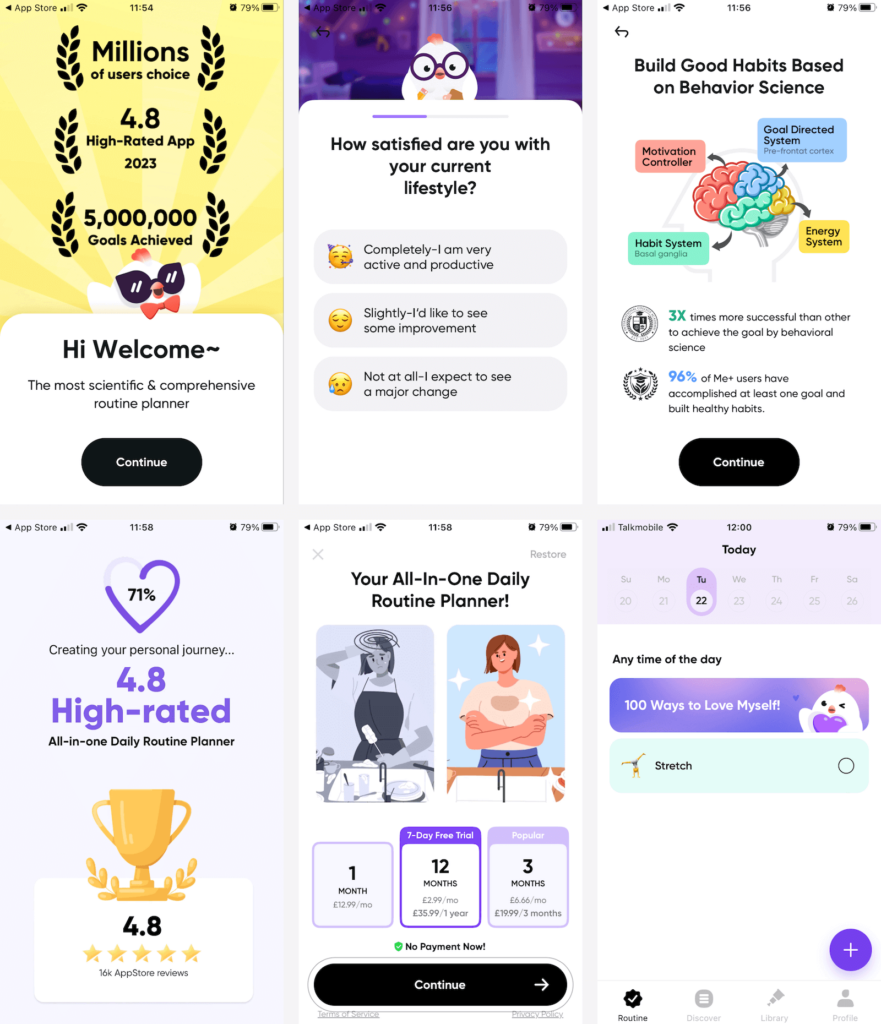
The very first app I downloaded to test and find an example for this blog — Me+, the number 1 health & fitness app in the UK — had an onboarding that lasted for about 45-50 different screens.
Some of those screens were static content, some required some form of interaction (like choosing a survey answer), and some were videos. Overall, without laboring over the process, it took me about 7-8 minutes to go from opening the app to being able to start using it. I assume it would be more like 10 minutes for people earnestly engaging with it.

That’s a great deal of friction. A lot is being asked of the user before they can even use the app for the first time. What’s going on here?
During the podcast episode with Erin Webster-Shaller and Paul Apollo from Lose It!, one of the first health and wellness apps on the App Store, Paul shared a curious observation.
“We noticed a trend, especially in the health and wellness space, that…onboardings are getting longer, and they’re getting longer in a way that is kind of inexplicable. There are questions being asked that there’s no way they’re being used as part of product setup.”
Naturally, the team wanted to test this observation for themselves.
“We started testing… What happens if we just ask people more questions? We don’t necessarily care what the answers are. We just make onboarding longer. And we found huge success: our trial [start] rates went up double digits as onboarding got longer and we basically just kept making it longer and longer until we got diminishing returns.”
What exactly is behind this unexpected behavior?
The Lose It! team believes that it’s the “promise” that this information will be used to customize the product. It’s not entirely a marketing ploy; some of that information is used to tailor the user’s experience. And the team uses it to great effect by asking users to set up premium features during onboarding, introducing the idea of loss aversion — e.g. you’ve said you want more calories on the weekend: make sure to use premium so you don’t lose access to the calorie cycling feature.
What you notice about health & fitness apps is their use of “science” in their marketing and onboarding. In the same way that Lose It! asks lots of questions to create a tailored experience for the user, Me+ introduces multiple screens in onboarding to lend credence to the idea that the app is backed by science.
Think about it this way: if the onboarding experience was extremely short, the user would have zero confidence that the app would be tailored to their goal. And while all good onboarding experiences try to facilitate the user in accomplishing their goal faster, the health & fitness space appears to be somewhat unique in just how far this can be pushed.
Add friction when it creates more value
To illustrate this different approach to onboarding, I’ll use another example from the health & fitness space.
RISE is a sleep fitness app. Leon Sasson, Co-Founder & CTO, revealed to us on the podcast that their onboarding has two goals. One is to convince people that sleep matters. The other is to convince people that RISE is the app to help them fix the sleep problem they might not even know they have.
This is not an onboarding teaching the user how to use the app, it’s an onboarding to help the user discover the app’s value. Even if that requires more friction.
“If your content is good and you’re showing people…the right information that actually is relevant for them, fewer screens is not actually better.
If we can do something that creates more value…but that requires more friction…we’re going to do it. We’re going to add the friction if it’s going to give us a more mind-blowing experience.”
Key in determining whether your app might benefit from a long onboarding is thinking about how easily or quickly the user will find the value. In an app that is more complex and requires more input and commitment from the user, then the onboarding has a bigger mountain to climb. Particularly when the user doesn’t have a clear action in mind when downloading the app. A RISE downloader may know that they want to sleep better, but they don’t know exactly how the app is going to help them achieve that aim.
How you should be measuring the efficacy of your onboarding
Before you rush out to test an uber long onboarding, make sure you’re measuring success in the right way.
If you do offer a free trial, trial start rate is a fine measure (the Trial Conversion Chart in RevenueCat). But it is very important to be aware of the long-term impact — who knows, maybe those long-onboarders make you less money overall. As we recommend for A/B price testing, use Realized LTV per customer — this will give you a view of how well these test cohorts monetize over time (ARPU Chart).
However, when it comes to monitoring onboarding performance more granularly, we’d recommend using an analytics tool to measure the “core funnel” and seeing the drop-off rates at each step of the process. We cover this in some detail in our lifecycle analytics guide.
As with everything: test it
In this blog, I am not advocating for introducing friction — whether you deem it necessary or unnecessary — mindlessly. I am advocating for, as with everything: rejecting received wisdom, considering the unique use case of your app’s users, and testing.
You may just find that the results surprise you.
In-App Subscriptions Made Easy
See why thousands of the world's tops apps use RevenueCat to power in-app purchases, analyze subscription data, and grow revenue on iOS, Android, and the web.


