Experiments Results
Experiments is currently in private beta. If you're interested in testing this feature, contact support to learn how to enable Experiments in your RevenueCat project.
Once enough data has been collected, the LTV model will start making predictions. These predictions will be displayed on the experiment's page below its details. It can take up to 24 hours for results to be displayed, but early data might not be representative of your user base. Expect to wait longer (e.g. one week) to be able to gain any actionable insight from the results.
Inputs
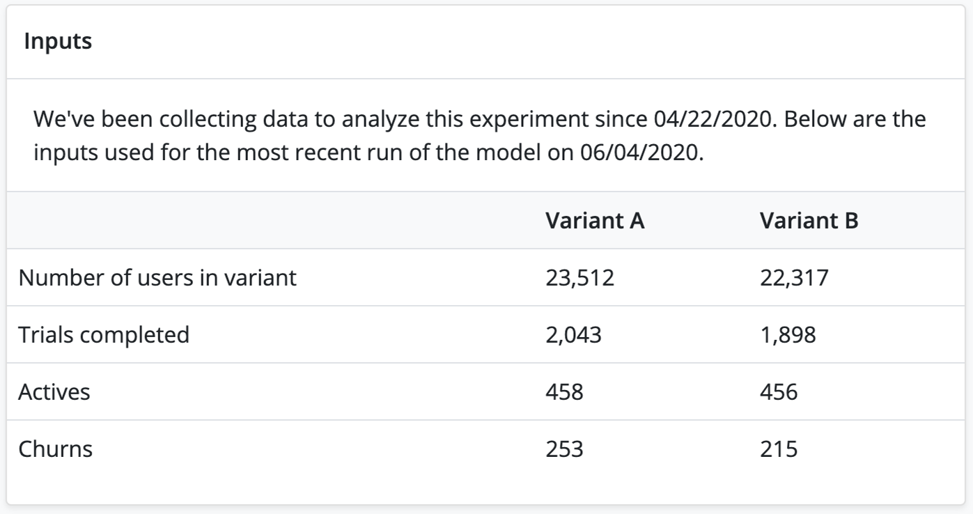
The inputs to the model are continually updated and shown here as the experiment runs. It is a current summary of the state of the inputs from when the data collection started to now (within 24 hours).
Data takes 24 hours to appear
The LTV model is run once every 24 hours.
If you're not seeing any data or are seeing unexpected results, try:
- Ensuring each product that is a part of the experiment has been purchased at least once
- Waiting another 24 hours until the model can process more data
When you stop an experiment, the LTV model will continue to be updated for 14 days to capture any additional conversion.
Analysis
This section is useful for understanding your sample size. Larger sample sizes are less prone to flukes. The model factors this concern into its calculations, but it can be useful to understand how much data the model is processing and whether the results are skewed by the data.
Definitions
| Term | Definition |
|---|---|
| Number of users in variant | The number of users in each group of the A/B test, as of the time the model is calculated. |
| Trials completed | The number of trials that have been completed in each group. This data does not differentiate between conversions or cancellations, it is the total number of trial period completions as of the time the model is calculated. |
| Actives | The number of active subscriptions in each group, as of the time the model is calculated. |
| Churns | The number of subscribers that have unsubscribed, as of the time the model is calculated. |
Only new users are included in the results
To keep your A and B cohorts on equal footing, only new users are added to experiments. Here's an example to illustrate what can happen if existing users are added to an experiment: an existing user who is placed in a cohort might make a purchase they wouldn't otherwise make because the variant they were shown had a lower price than the default offering they previously saw. This might mean that the user made a purchase out of fear that they were missing out on a sale and wanted to lock in the price in anticipation of it going back up.
Example
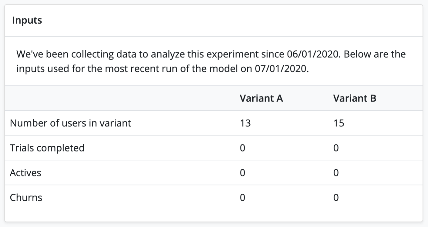
In the example shown in the below screenshot, there have been no trial completions, active subscriptions, or churn. While the model will be able to make a prediction (possibly with high confidence), it won't be representative of real-world user behavior, so in this case you should wait until you have a good distribution of data.
Results
This section explains the probability that one variant has a higher LTV, how confident the model is in its prediction, and what the LTV might be for each variant. There are three parts to it: the LTV period, the LTV gauge, which shows which odds that one LTV is better at the current moment, and the chart, which shows the likelihood over time.
LTV Period
The model can predict the LTV over various time periods: 1 month, 3 months, 6 months, 1 year, and 2 years. Choosing the LTV period that will result in the best predictions for your app depends on your trial and subscription periods. For example, if you were A/B testing a monthly subscription and a yearly subscription, the monthly subscription might outperform in the 1 or 3 month periods but underperform on the 1 year period.
Note: shorter LTV periods have less uncertainty but more noise than longer LTV periods. For example, while the 2-year LTV period will smooth out the spikes of the 1-month LTV period, it will also be less certain of its prediction. Reference the LTV Chart and Predicted LTV charts to understand the best LTV period for your test - noisier data will cause more fluctuations in short term predictions.
LTV Gauge
The gauge is segmented into three sections:
- Tossup: there is no probable significance in the data. In other words, the model is not confident in its decision that one offering has a higher LTV than the other. If your experiment results in a tossup, you can reasonably assume that the differences between the two variants did not significantly affect the LTV predictions. From here, you can run further tests with larger differences between the variants or test other variables. Sometimes if the variants differ in more than one way, the differences can conflict and pull the results in opposite directions. For example, if two variants differ in subscription length and price, the one variant might be more attractive on price but less attractive on subscription length, thereby resulting in a tossup.
- Favoring: The model has a clear favorite here, but there is a 1 in 5 chance that it's incorrect by pure bad luck.
- Likely: The model is pretty confident in the winner, the chance that it's wrong by pure chance is approximately 1 in 20.
The needle can move significantly day to day as more data is gathered. If you want to see a history of LTV predictions to spot trends, see the LTV chart.
The paragraph below the gauge explains the gauge's results, including not only the winning variant, but the confidence in the model's result.
LTV Chart
The chart shows the likelihood that one offering has a higher LTV than the other over time. This chart can help you understand how the probability changed over time as more data was collected. It's normal to see the line fluctuate as more data is gathered such as initial purchases, renewals, churn, etc.
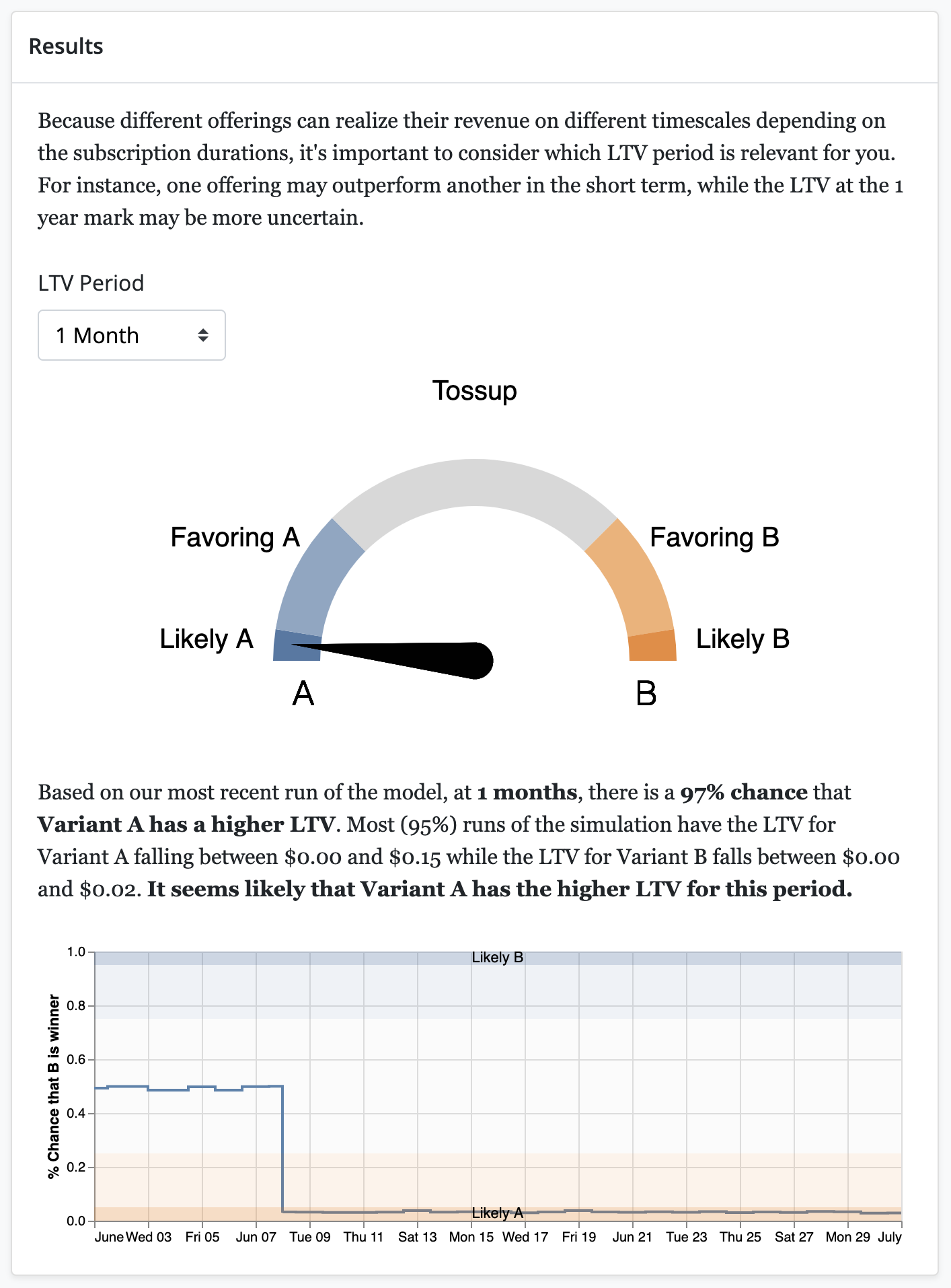
In this example, it is clear that variant A is the winner, with a 97% chance that it has a higher LTV than variant B.
Analysis
While every app and every A/B test is different, a "clear" winner is one in which the predicted LTV is comfortably within the "Favoring" or "Likely" segments. If the gauge is nearing or in the "Tossup" segment, check the LTV chart for any recent fluctuations that are throwing off the needle. If the LTV chart has such fluctuations, try increasing the LTV period.
Example
In this example, the first screenshot shows the gauge indicating that the results are a tossup. However, the LTV chart seems to have a trend towards "Likely B" but the most recent data is swaying the gauge. By changing the LTV period to 3 Month in the second screenshot, the gauge matches our intuition about the trend, favoring B slightly more than A. While B is slightly edging out A, this result does not have a high enough confidence for us to choose variant B as the current offering. More tests should be done to optimize the LTV. Finally, when the LTV period is changed to 1 Year in the third screenshot, the model becomes less certain of its prediction, which means there is a significant probability that the results are due to chance.
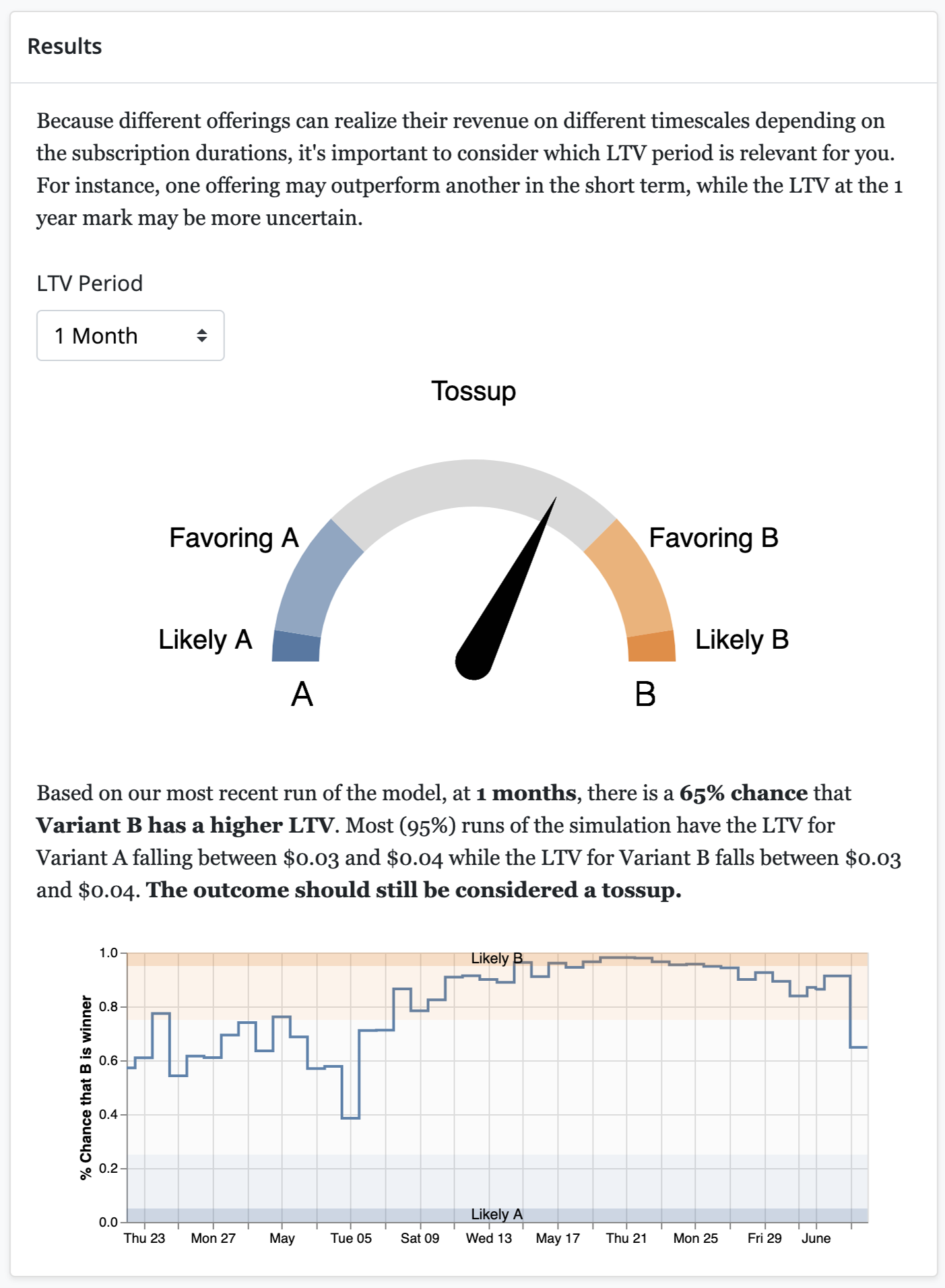
The gauge is indicating that the results are a tossup. However, the LTV chart below it seems to have a trend towards "Likely B" but the most recent data is swaying the gauge.
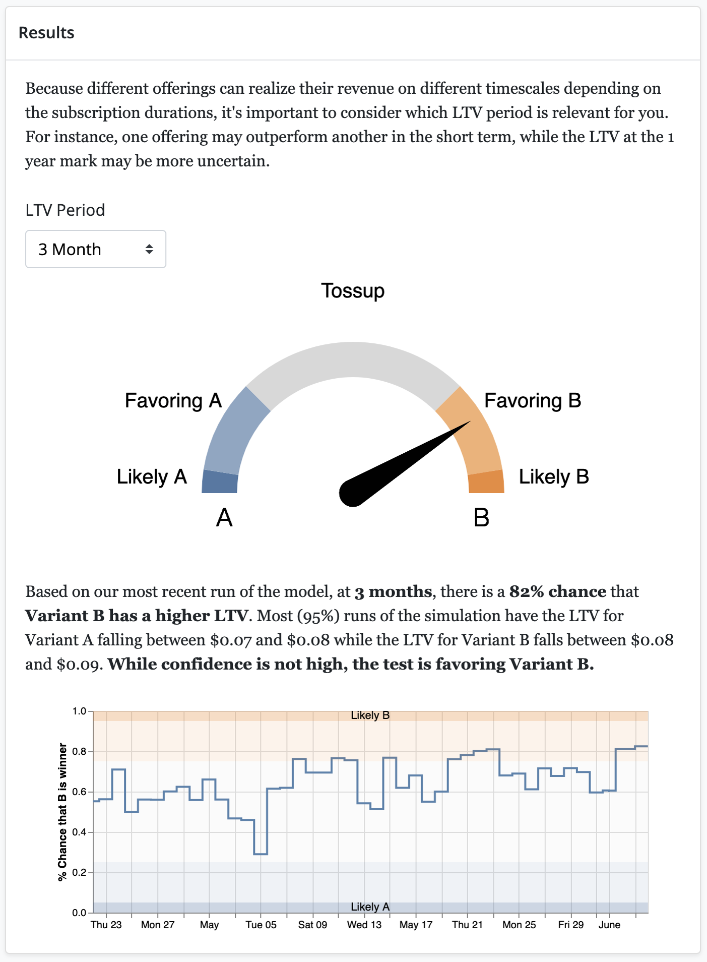
Changing the LTV period to 3 Month confirms our intuition that the model was trending towards slightly favoring B over A.
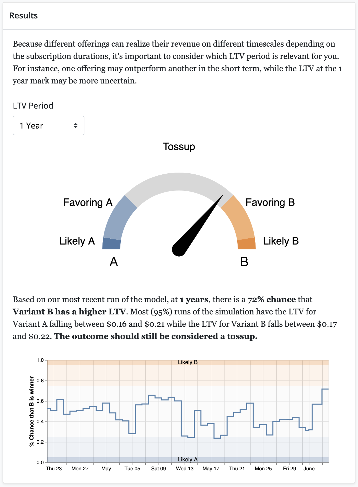
Changing the LTV Period to 1 Year introduces too much uncertainty into the model to make a confident prediction.
Predicted LTV
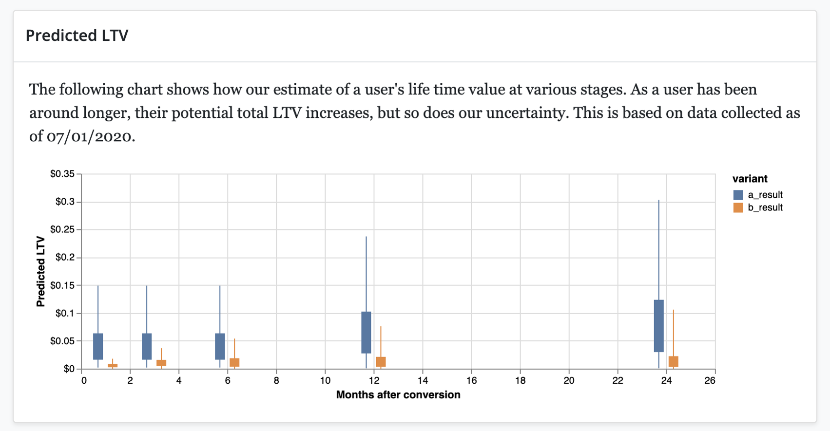
The Predicted LTV chart predicts the LTV at certain points in a cohorts lifetime. They include one month, three months, six months, one year, and two years. These points often line up with renewals so that you can see the LTV predictions for two products with different subscription lengths.
Each prediction is depicted by a box and whisker plot. The box represents 50% of model runs and the whiskers plus the box represent 95% of model runs.
Predictions further in the future will have longer wicks which represent greater uncertainty in the actual LTV.
Analysis
This chart can help you see why results might be toss-ups based on overlap between the predicted LTV of the two variants. The less overlap between the two measures, the clearer the winner is.
Example
For example, in the following screenshot, the predicted 3 month LTV has the least amount of overlap. That means that the model is most confident predicting the 3 month LTV, followed by the 6 month LTV. Conversely, the 1 month and 2 year LTV predictions have significant overlap - these predictions are tossups.
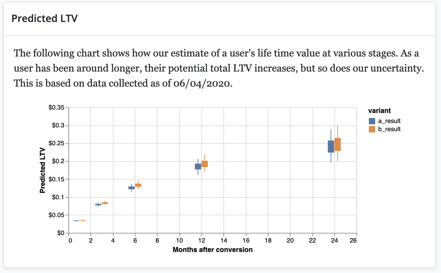
The overlap is smallest in the 3 and 6 month predictions, which means the model will have the most confident predictions for those LTV periods.
Updated 7 days ago
