How to build an onboarding campaign to prevent new user churn with OneSignal + RevenueCat
Explore how OneSignal's seamless messaging blends with RevenueCat's detailed subscription analytics to tackle user churn in subscription apps.


Brian Wisniach
This tutorial first appeared on the OneSignal blog.
For subscription apps, making the right impression is crucial. The median app-download-to-trial-start conversion rate is just 3.7%. This means 96.3% of users don’t take that vital first step in engaging with the apps they download.
Not all subscription apps offer a free trial (one-third do not), but the takeaway is clear: subscription apps have to overcome this roadblock if they’re to successfully monetize their downloaders.
Onboarding is one of the most important ways of nudging users onto the right path of trial and conversion. But there is a balance to be struck. It’s essential to educate users about the app’s features during onboarding, but bombarding users with too much information too quickly can overwhelm them and lead to disengagement or abandonment.
On the other hand, if the onboarding process doesn’t adequately educate users about the app’s value and features, users may not fully understand the app’s benefits. This can result in early drop-offs, as users might not see a reason to continue using the app.
Two-pronged problems often require a two-pronged solution. With the powerful integration between OneSignal and RevenueCat, let’s walk through how to craft an onboarding sequence that reduces user churn specifically for subscription-based apps.
Understanding user churn
First, let’s get on the same page about new user churn. Churn describes the number of users a mobile app is losing within a given timeframe, commonly measured seven days or 30 days after installation. Every mobile app, subscription-based or otherwise, experiences user churn. In the subscription model specifically, your app’s financial success relies on a consistent stream of subscribers. When users cancel their subscriptions or stop using the app altogether, it leads to a loss of recurring revenue (and a decline in long-term sustainability.)
Furthermore, acquiring new users to replace churned ones is costly, making retention of existing subscribers absolutely critical for maintaining profitability and growth.
On average, apps lose 77% of their DAUs (daily active users) within the first three days after installation. Within 30 days, this number jumps to a 90% loss of DAUs.
So yes, user churn is the built-in leaky hole in the boat of every mobile app… but that doesn’t mean there aren’t ways to make it smaller. A proactive approach to combating user churn can help subscription-based apps identify and address issues before users decide to cancel their subscriptions. By engaging users with personalized content, timely reminders, and tailored incentives, apps can improve the overall user experience from the starting line, boosting retention rates and ultimately enhancing their long-term revenue potential.
Distinguishing user churn from subscription churn
While user churn pertains to the overall loss of app users, subscription churn is more specific. It measures the percentage of active subscriptions that were lost during a given period that have not yet resubscribed. While all subscription churn is user churn, not all user churn is subscription churn. For instance, a user might continue using a freemium version of an app after their subscription ends, contributing to subscription churn but not user churn. According to research, after one year, weekly subscriptions retain about 3%, monthly ones about 11%, and annual ones around 28%.
The power of onboarding messaging
Mobile app onboarding acts as the bridge between user interest and user retention. This process can take various forms, including tutorials, interactive guides, tooltips, and video walkthroughs. Regardless of your mobile app onboarding strategy, one thing does remain constant: Without a proper welcome sequence to pave a path of effortless engagement from the start, users will immediately churn — most likely due to either a lack of understanding of your app or sheer boredom and distraction.
A well-designed onboarding sequence should accomplish the following three actions to drive user interest and jumpstart subscription revenue.
- Educate – Onboarding should provide clear information about your app’s key features, how to navigate, and how to perform essential tasks.
- Engage – Onboarding should capture users’ attention and interest from the moment they first open your app, enticing them with immediate key value drivers and rewards.
- Enable – Onboarding should build a foundation for continued success within your app, well after onboarding is complete.
Typically, mobile apps rely on three types of onboarding to give new users traction within their app to promote retention: Function-oriented, benefits-oriented, and progressive onboarding. While there is no end-all-be-all between the three to ensure the least amount of churn, the type of your mobile will most likely dictate which onboarding sequence to lean on the most.
| Function-oriented | Benefits-oriented | Progressive |
|---|---|---|
| Productivity & collaboration tools | Health & wellness apps | Project management tools |
| Financial management apps | Premium eCommerce & shopping apps | Sales management & digital marketing suites |
| E-learning & online courses | Virtual events & conferencing apps | Business analytics apps |
| Video editing and creative apps | Streaming services | Language learning platforms |
| Gaming subscription services | News & magazine subscriptions | Coding & development platforms |
Function-oriented onboarding – Suitable when your app’s value is primarily derived from its features, and users need to learn how to use these features to get the most out of the experience. Function-oriented onboarding is best for apps with complex interfaces or features, ensuring that users understand how to navigate through the essentials of the app, without uninstalling or unsubscribing due to frustration.
Benefits-oriented onboarding – Most effective when your app’s value proposition is easily understood and appreciated without an in-depth understanding of its features. Benefits-oriented onboarding packs the most punch with apps that provide clear, immediate benefits or solutions to users’ problems. If your app’s primary selling features are easy adoption and time-to-value, this onboarding sequence aims to focus on lifestyle improvement over any specific in-app features.
Progressive onboarding – Perfect for attempting to ease users into your app’s ecosystem, reducing the risk of overwhelming them and encouraging long-term engagement. Subscription-based apps or apps with a diverse feature set can both benefit from this gradual onboarding sequence.
Crafting the winning onboarding sequence
Step 1: Define your onboarding goals
Before you start designing your onboarding sequence, it’s crucial to define clear goals.
How long should onboarding take?
- You may want to leverage a short-term onboarding process over one to three days to throw users into your app more directly, especially if your app is more simplistic in nature.
- Perhaps seven days is the sweet spot to properly educate new users on key app features.
- Alternatively, you may get creative and use a refresher onboarding sequence to periodically remind users of different features or provide updates on new functionality.
What metrics will you use to measure success?
- User Activation Rate: This metric tracks the percentage of users who complete a specific action or set of actions during onboarding. This could mean signing up, completing a profile, or engaging with a core app feature.
- Onboarding Completion Rate: Measure the percentage of users who successfully complete the entire onboarding process and go on to use the app regularly or subscribe to a premium service.
- Drop-off Rate: Analyze the stages of your onboarding flow and identify where users tend to drop off. High drop-off rates at certain points may indicate issues that need attention.
- Revenue Metrics: If the primary goal of onboarding is to drive revenue (e.g., subscription conversion), track revenue-related metrics, such as average revenue per user (ARPU) and user lifetime value (LTV).
- Churn Rate: Measure the rate at which users stop using the app after onboarding. Lower churn rates indicate that onboarding effectively retains users.
What do you want to achieve during the onboarding process? These goals will shape your content, messaging, and overall strategy. Common onboarding goals include:
- User Activation: Encourage users to complete a specific action, such as signing up, setting up a profile, or completing a tutorial.
- User Education: Provide valuable information about your app’s features and benefits to help users understand its value.
- User Engagement: Foster early engagement by showing users the most relevant content or features.
Step 2: Segment your user base
What you need to start:
- A OneSignal free account (or upgrade to paid for more complex use cases and to access Journeys)
- A RevenueCat account (integrations like the one with OneSignal are part of the standard, free plan)
- Integrated RevenueCat SDK in your mobile app (iOS | Android | React Native | Flutter)
- Integrated OneSignal SDK in your mobile app
- OneSignal integrated with RevenueCat
Not all users are the same, and a one-size-fits-all approach rarely works for mobile app onboarding. Utilize RevenueCat’s subscription analytics to segment your user base based on their subscription status. This segmentation allows you to tailor the onboarding experience to different user groups.
For example, targeting new users allows you to provide a comprehensive introduction to your app’s core features. Targeting free trial users affords you the space to emphasize the specific benefits of upgrading to a premium subscription. You may want to only focus on returning users to highlight what’s new since their last visit to re-engage them.
RevenueCat’s OneSignal integration docs detail the events that you can use to tag users in OneSignal, which can then be used for your messaging segmentation.
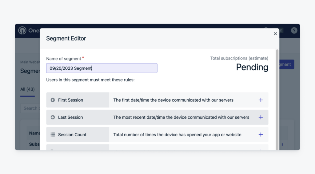
For this example, we’re going to use a filter native to OneSignal and show you how to segment users who have been dormant for over 10 days:
In your OneSignal dashboard, in Audience, navigate to Segments select New Segment.

This is where you will select your filters (which may be combined to create specific segments.) Select the Last Session filter to target the last time a user visited your app or website.

Set this last session to be “greater than” 240 hours. This will tell us how many users have not returned to the site or app in over 10 days.

Step 3: Create personalized onboarding flows
Your mobile onboarding sequences should be clear and concise, uniform in design, and encourage new users to start succeeding with your app immediately.

To replicate the above example in OneSignal, you’ll be using the in-app carousel feature to easily customize your onboarding walkthrough process. In the carousel builder, you can create up to 10 cards containing copy, logos, and your choice of CTA.
You can customize your sequence on a card-by-card basis by editing fonts, specific colors, alignments, linking destinations. When you thin you’ve got a winner, swipe the in-app message Demo screen to view the card like a real device.

To fully understand the importance of both timing and targeting when it comes to your onboarding sequence, let’s walk through a day-by-day breakdown of an onboarding flow for a hypothetical music streaming app called “MusicWave.” The app offers a 7-day free trial with multiple subscription tiers (Free, Premium, Family).
Day 1: Trial Start Push Notification
Channel: Push Notification

Message: “Welcome to MusicWave! 🎶 Enjoy Premium features FREE for 7 days. Listen ad-free, download songs, and create playlists. Tap to start.”
Goal: Engage users at the beginning of their trial and inform them about Premium features.
Bonus tip: You only get one chance at a first impression. Ensure that your first push notification provides a seamless and valuable experience. In the above example, you may direct users to a personalized, curated playlist or a selection of trending songs to immediately showcase the app’s value. The more painless a user’s first few taps are in your app, the chances of user engagement and retention increase dramatically.
Day 2: Benefits-Oriented Onboarding
Channels: In-App Message, Email
In-App Message: “Unlock Full MusicWave Experience!”
Goal: Highlight Premium features and encourage users to explore Premium-exclusive content.
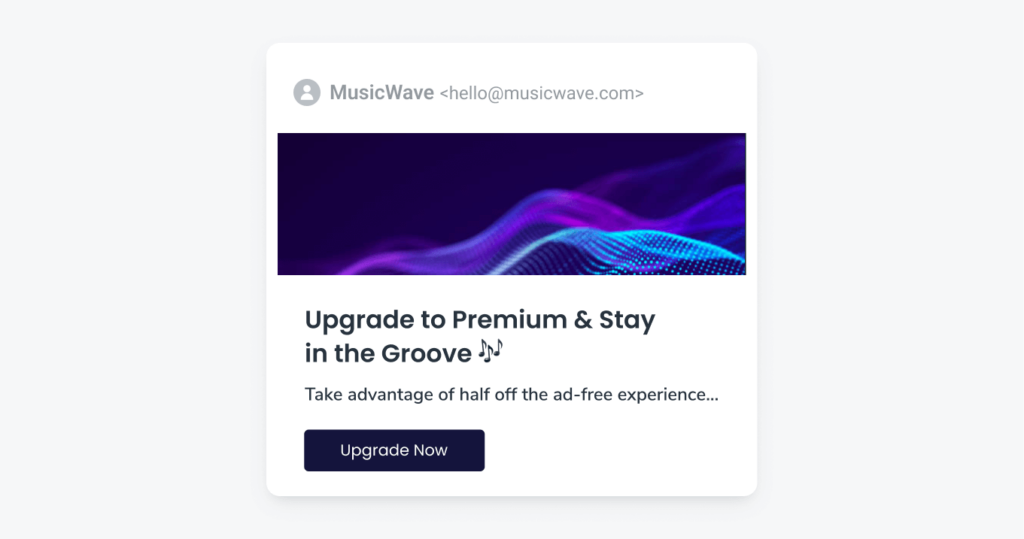
Email:

Subject: “Upgrade to Premium for Ultimate Music Experience”
Pre-header: “Take advantage of half off the ad-free experience…”
Goal: Emphasize Premium value and introduce a limited-time offer for subscription upgrade conversions.
Bonus tip: Show, don’t just tell. Instead of simply listing premium features, use interactive onboarding to demonstrate how to use them effectively. For this example, you may decide to guide users through the process of creating their first playlist or downloading a song offline. Hands-on experiences help users understand benefits better.
Days 3-4: Trial Expiration Warning
Channel: Email

Subject: “Your MusicWave Trial Ends Tomorrow!”
Body Message:
“Hi [User’s Name],
Your MusicWave Premium trial ends tomorrow! 🎵 Upgrade now to avoid interruptions and continue enjoying ad-free music: [CTA Button]: Upgrade to Premium
Stay tuned,
The MusicWave Team”
Goal: Send a reminder about the trial expiration and offer an upgrade option.
Bonus tip: Offer an irresistible incentive. To encourage users to upgrade before the trial ends, provide an irresistible incentive, such as an exclusive curated playlist or early access to new releases. Make sure to highlight this incentive in the email to capture their attention and motivate them to take action.
Days 5-6: Subscription Entitlement ID Targeting
Channels: In-App Message, Push Notification
In-app message:
“This encore is unlimited. Upgrade to premium for just $7.99/month!”
Goal: Use entitlement IDs to target Trial and Free plan users who have demonstrated active engagement with the app. These are users who have listened to music, created playlists, or interacted with the app’s content during their trial period.
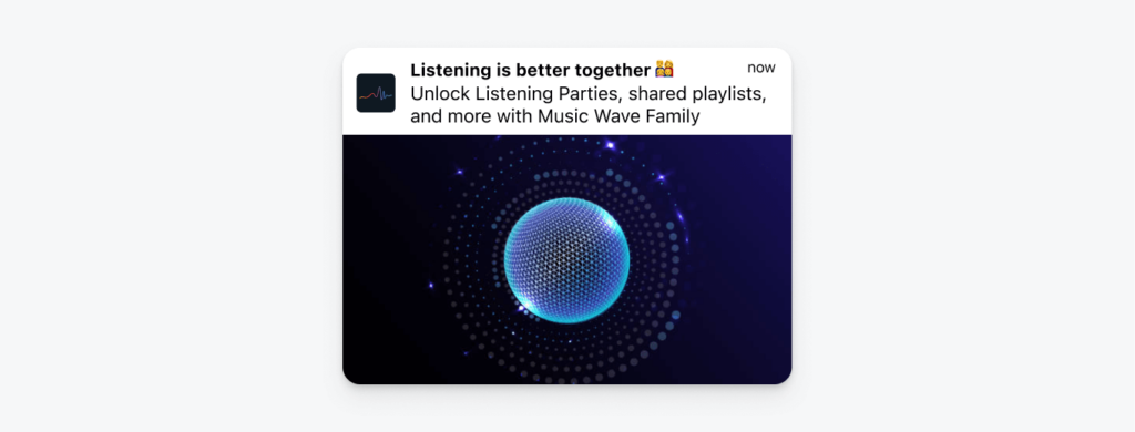
Push Notification (for Family Plan Users):

Goal: Highlight Family plan benefits and cost-effectiveness. Use entitlement IDs to target users based on their current plan and offer relevant upgrades.
Bonus tip: Leverage social proof. To encourage users to upgrade to a premium plan, consider incorporating social proof elements in your in-app message and push notification. Highlight testimonials or reviews from satisfied Premium users who have experienced the app’s full benefits. This instills trust and confidence in the upgrade decision, increasing the likelihood of conversion.
Day 7: Trial End Reminder and Grace Period Notification
Channels: Push Notification, In-App Message
Push Notification (Morning):
“Last Day of Your Premium Trial!”
Goal: Remind users that the trial ends today and provide an upgrade link for last-minute conversions.
In-App Message (Evening, After Trial Ends):

Message:
“Your trial is over but it’s not too late! Last chance to go Premium and keep your custom playlists!”
Goal: Use trial end and grace period notifications to prompt users to take action before losing Premium access.
Bonus tip: Create a sense of urgency. In the morning push notification, include a limited-time offer or discount for upgrading. Convey a sense of urgency by emphasizing that it’s the “last day” of the trial. Encourage users to act quickly to retain Premium benefits. If you opt for an email reminder instead, consider implementing a ticking countdown clock to capitalize on FOMO.
Ongoing: Post-Grace Period Engagement
Channels: Push Notifications, In-App Messages
Continue engaging users with personalized content recommendations. Use push notifications to highlight new releases and exclusive content with occasional reminders about Premium benefits and subscription options.
Goal: Keep users engaged and interested in the app’s content even after the trial and grace period, with the goal of converting them into paying subscribers over time.
Bonus tip: Gamify the user experience. Implement gamification elements to make the app experience more enjoyable and interactive. For example, create challenges, badges, or rewards tied to user activity. Offer special privileges or content to users who complete specific actions or achieve certain milestones within the app. Gamification keeps users engaged, motivated, and more likely to stick around.
Step 4: Implement A/B testing
A/B testing is the closest thing you will have to a crystal ball for onboarding success. Whether you’re using OneSignal’s A/B testing to compare tone, emojis, images, and sounds or you’re leveraging RevenueCat Experiments to test pricing and packaging changes on your paywall… the value of conducting real-time mobile message experiments cannot be understated.
Use these A/B testing examples for inspiration to get started:
- Test variations of your welcome message to see which one leads to higher activation rates.
- Experiment with different incentives to encourage users to subscribe, such as discounts or exclusive content.
- Monitor how changes in the onboarding flow impact user retention and engagement.
- Compare subscription trials and offer types to find out which incentives carry the most perceived value.
- Mix and match how features are packaged and bundled into different pricing plans to hone in on the most cost-efficient ratio of immediate value-to-upsell potential.
And it doesn’t stop there. Your Onesignal ID is connected to Revcat, giving you valuable subscriber history and the ability to look at the lifetime value of your users. Use these LTV benchmarks to help measure the success of your onboarding campaigns over longer periods of time (6 months and beyond.)
Some things are just better together
When it comes to mobile onboarding, OneSignal’s messaging reach combined with RevenueCat’s in-app subscription enablement, create a perfect storm of engagement. Rather see for yourself? Both these powerful tools are available for free to start creating onboarding sequences that effectively help extinguish runaway churn rates.
Sign up to OneSignal and RevenueCat to get started.
In-App Subscriptions Made Easy
See why thousands of the world's tops apps use RevenueCat to power in-app purchases, analyze subscription data, and grow revenue on iOS, Android, and the web.


